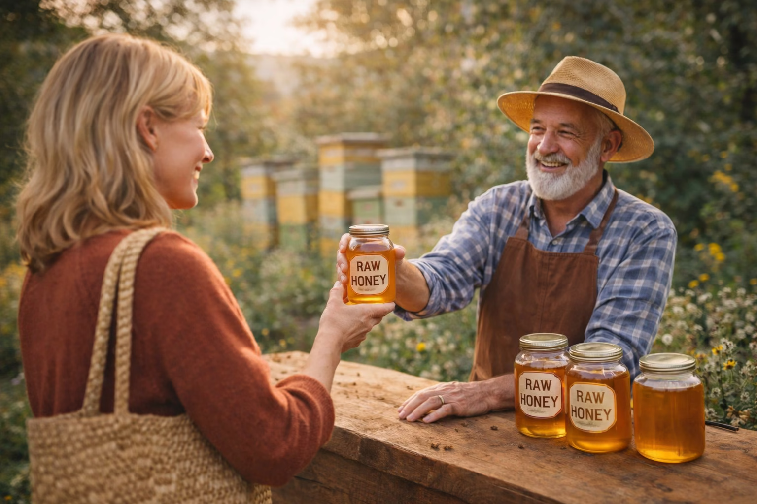
The label on a honey jar is often the first moment of contact between the customer and your product. Before they taste your honey, before they ask questions, before they read anything, they look at the jar. A clean, simple label can instantly create trust and curiosity.
You don’t need complex design skills to make an attractive honey label. A few thoughtful choices can turn a plain jar into something that feels warm, natural and professional.
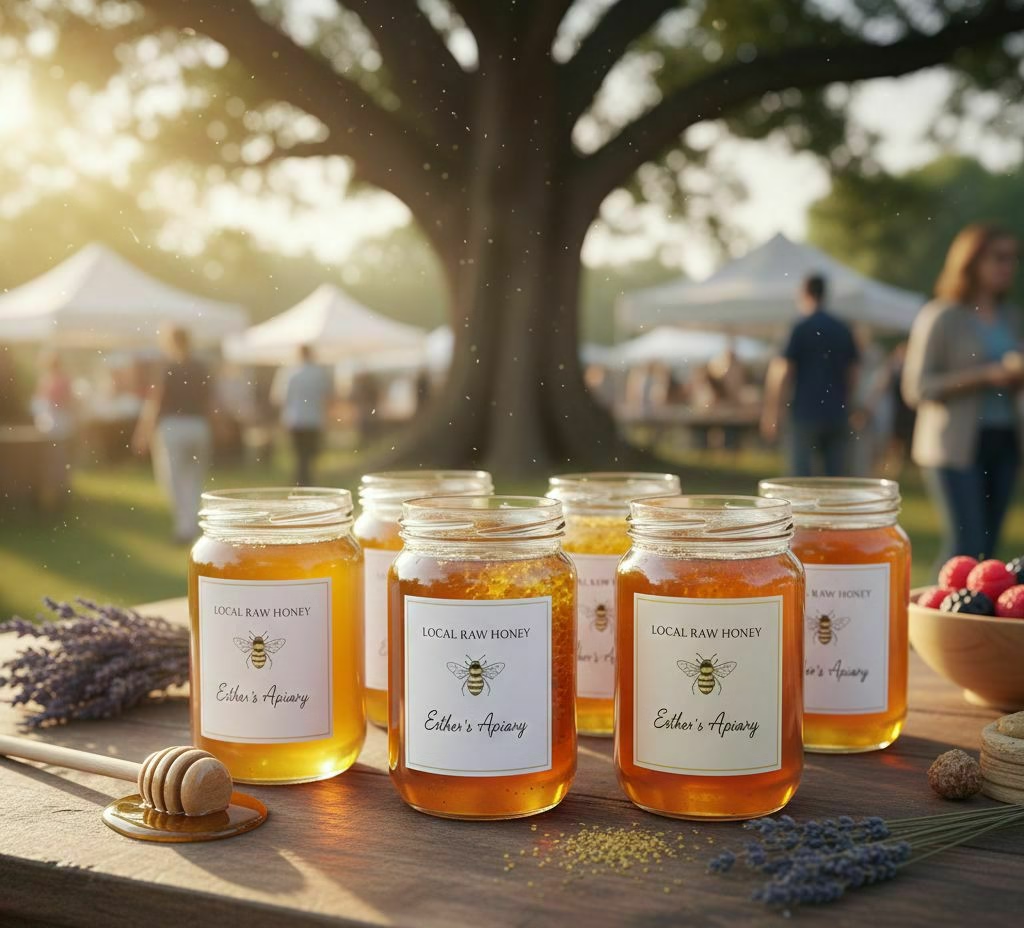
A Calm, Natural Color Palette
Customers associate honey with nature, purity and simplicity. Labels that use gentle tones such as cream, white, beige or soft yellow tend to feel more trustworthy. These colors also help the golden color of the honey stand out, which is something customers love.
Clear, Easy-to-Read Text
A label shouldn’t overwhelm the eye. Clear fonts, simple layout and minimal text make the jar feel premium. Customers want to instantly recognize what the product is, where it comes from and who made it. When a label is clean, the product feels more authentic.
A Touch of Personality
A tiny detail can give a label character. It might be a small bee illustration, a simple logo or a handwritten-style font for your name. These little touches make the product feel personal and handcrafted, which customers value deeply.
Conclusion
A well-designed honey label doesn’t need to be complicated or expensive. With a calm color palette, clear text and one or two personal touches, your jars can instantly look more attractive on any shelf or market table. Simple changes often create the strongest impact, especially for natural products like honey.